Anglophone East School District Logo: A Symbol of Compassion in Education
The new logo of the Anglophone East School District is a vibrant and meaningful design, thoughtfully crafted to represent the core values, vision, and cultural inclusivity of our district. Created by artist Garry Sanipass, the logo embodies a deep connection to community, culture, and education, beautifully blending symbolic elements to reflect our mission to create a caring and compassionate learning environment.

The Rings: Circles of Care
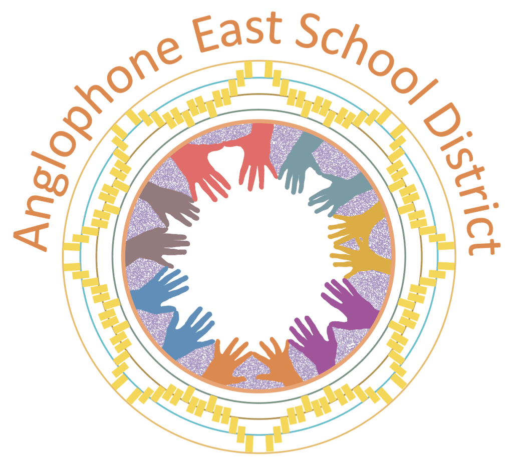
At the heart of the logo are concentric rings, representing the interconnected circles of care that surround AESD students. These rings reflect the multiple layers of support and influence in a student’s life:
• Family: The foundational support system nurturing every child.
• Educators: Guiding students with knowledge, care, and mentorship.
• School Community: Fostering collaboration and inclusion within our schools.
• The Community at Large: Highlighting the broader support network that helps every child thrive.
The circular form mirrors the structure of a sweat lodge, symbolizing protection, reflection, and community under an Indigenous lens. The repetition of the rings also signifies continuous learning, growth, and sound, tying to the local rhythm of life and the enduring journey of education.
________________________________________
The Hands: Diversity, Legacy, and Sharing
The hands radiating inward form the centerpiece of the logo, with vibrant colours symbolizing the diversity of our students, staff, and communities. Each hand is a reflection of our history and the desire to “leave a mark” for future generations. This motif echoes ancient traditions, where hands on cave walls served as a medium of communication, storytelling, and identity.
The inward-reaching hands are a metaphor for sharing knowledge and fostering community. They demonstrate the interconnectedness of our present work with the wisdom of our ancestors and the aspirations of the future.
________________________________________
The Music Notes: Sunlight, Harmony, and Breath
Embedded within the rings, music notes symbolize multiple layers of meaning:
• The Sun: The shapes and colors are reminiscent of sunlight, a nod to our region as the “land of the rising sun,” also known as the home of the People of the Dawn.
• Breath: Music reflects the rhythm of breathing—taking in and giving back—a parallel to the natural balance of teaching and learning.
• Harmony: Music, as a universal language, represents harmony with ourselves, each other, and nature. It reminds us of the importance of balance and compassion in the education system.
The design pays homage to the natural and cultural rhythms of New Brunswick, weaving local sounds and traditions into the fabric of the logo.
________________________________________
The Colors: Repetition and Resilience
The repetition of colors in the rings and hands emphasizes unity and interconnectedness. The cyclical nature of the design symbolizes resilience, echoing the enduring patterns of sound, life, and growth in our communities. Each hue embodies vibrancy, inclusivity, and hope, painting a vision of a compassionate and diverse educational landscape.
________________________________________
Compassionate Education: The Heart of AESD
Our logo reflects our commitment to fostering a culture of compassion in education. Each element—from the rings and hands to the music notes and colours—speaks to our collective responsibility to care for one another, support each other’s growth, and honour the history, culture, and diversity of our communities.
Created by Mi’kmaq artist Garry Sanipass, this logo is a celebration of harmony, compassion, and the values that define AESD. It inspires us to continue our journey through a compassionate lens, enriching the lives of every student we serve.
